Launching SFTP Robot & unveiling new homepage
Some customers have already had the pleasure of using it behind the scenes, but now we are finally ready to officially released our SFTP Robot. It makes storing files on your own servers a breeze and costs just the same as the /s3/store Robot. For all the intricate details, please check out its documentation and feel free to leave your comments on it.
That is not all, however! We have also recently gone live with a new homepage that introduces our service in a better way, lists some customers, provides a small preview of how the integration works, and features a great graphic from SoftFacade, which shows our Robots at work.
I'd like to dig a little deeper into the process of how that graphic came together, because it was an interesting process and I think the result is awesome.
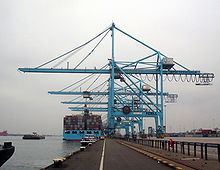
First off, we contacted SoftFacade, told them who we are and what we do. We told them we wanted a nice branding graphic that shows what we are all about, in a clear and simple format. We showed them a picture of a crane moving containers as a means to portray what we are doing with files, since we imagined something like a big shipping facility to be shown on our final graphic:
Then, even before the first sketch, we had the idea of a long Assembly line (think of the way cars are built) with robots on the side, each doing their job. And SoftFacade quickly came up with the first sketch:
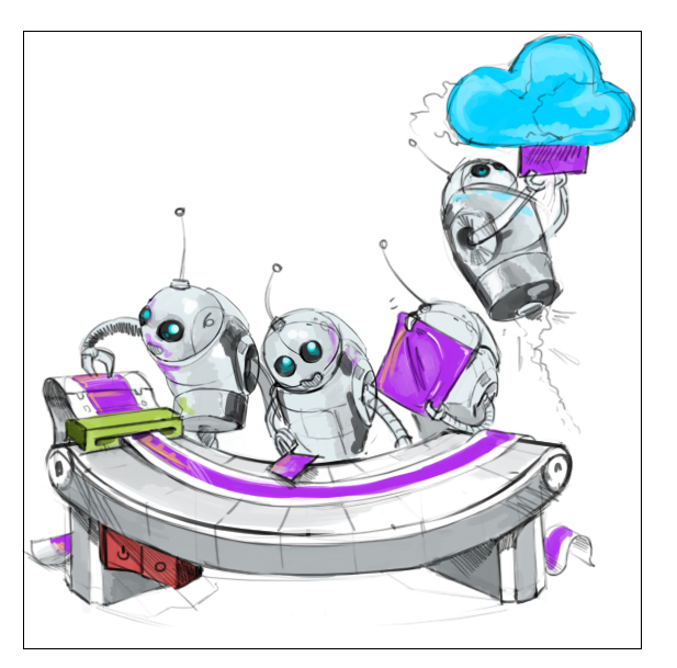
We didn't like it so much overall, because the robots didn't look like the ones on our website. They looked more like beetles. 😄 We did feel, however, that our general idea was picked up very well and we knew this was heading in the right direction!
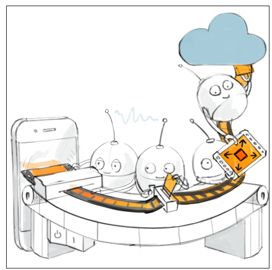
We asked SoftFacade to refine the robots a little and to also add a video stream onto the table for the robots to work on. See how much of an improvement the second sketch was already:
We then asked them to make the iPhone (which represents any smartphone there) on the left a little more apparent, for instance by adding a database barrel in the top right, and to have the robot that was making the image larger, should in stead make it smaller. In fact, the smartphone was initially meant as a browser, but that got fixed up later. This is what we got back from SoftFacade:
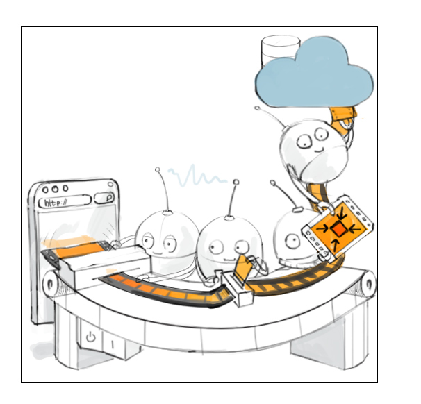
We were still not completely satisfied with the phone/browser on the left, and we gave some further feedback on that. The final sketch we received was this one:

Now we were cookin'! We absolutely loved this sketch and it was getting us really excited! We knew the work they had pulled off for SimpleGeo and many others. Their pixel-perfect HD images are legendary, and if this final sketch of our little robots already looked so great, how much then would the HD version blow us away?
The first colored HD version shipped two weeks later:

Fantastic! Loved it. ❤️ We did ask for some color changes as we didn't like the green. Also, the robots' mouths should be white, and we wanted an audio jack in there as well, to signify that we work with audio as well. Some alignments and various small fixes later, we go this:

Marvelous detail! Notice the engraving on the front side of the table. ❤️ We then asked them again to fine tune the browser, because we thought the blue map in the background was a bit weird. We also wanted to add an upload progressbar to it:

Great! The only real change we wanted there was to change the progress indication to look more like the one we are using in our jQuery SDK.
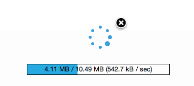
Only two hours later, we got our final result:

Thank you SoftFacade for this marvelous graphic! We are so proud of it that we have already made some T-shirts with it. 🎉
We would also like to thank everybody who helped provide feedback on the homepage during its development! Deserving of special mention here are: Garret Woodworth, Peter Gerard, Josh Crowder, Tony McAllie and Felix Clack. Thank you very much for your support!
Feel free to comment and tell us if you like our new homepage 😄